Basic Theme for Ext JS 5
Basic 5 theme is designed to enhance standard gray Ext JS theme. It features gray body with subtle shadows and gradients appropriate for any business application. Colored ui-styles can be applied to highlight main application elements and corporate colors. Basic theme looks the best in medium size and doesn't hurt your eyes after hours of work.
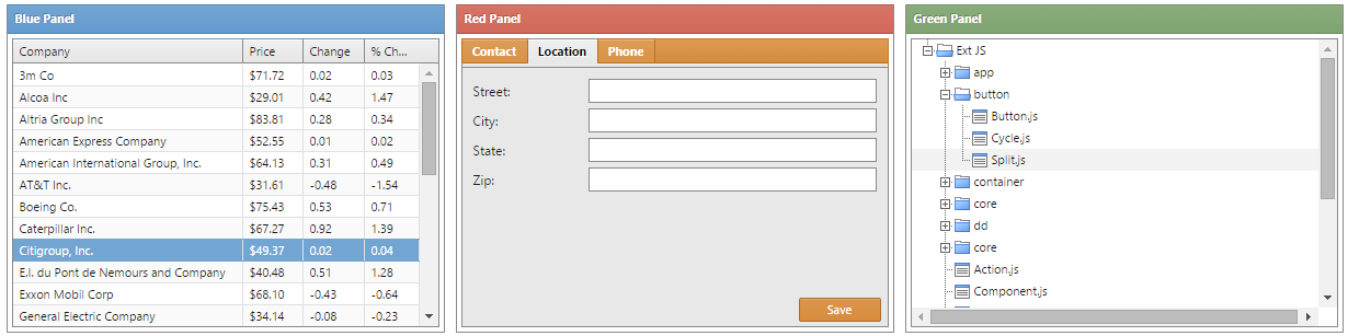
Colorful Application Components
Basic offers five different ui colors which can make your application look live. Besides that, this theme allows you to create a custom ui styles matching corporate colors of your company.
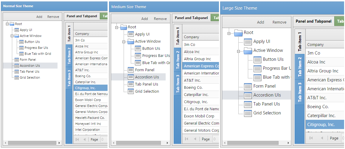
Small, Medium or Large Size
If your customers are complaining about small font size, Basic will help you.
There are three different sizes to choose from.
For those who have purchased SCSS license, modifying theme size is very simple. By changing variable $theme-size (located in sass/var/Component.scss), you can make most of your application components bigger.
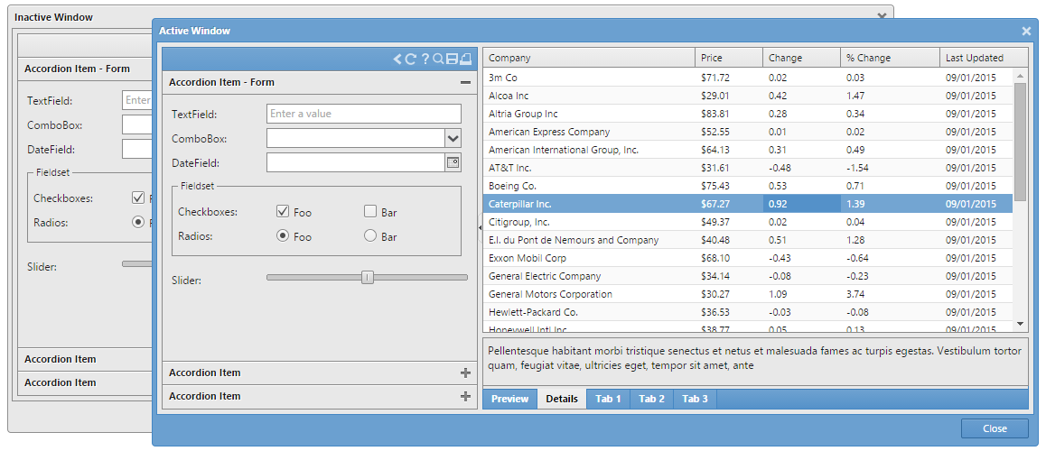
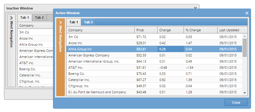
Highlighted Active Window
Basic has the ability to display active window in a different color, while all background windows turn gray, which is great for window based Ext applications.
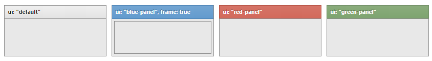
UI styles
UI styles applied to different widgets are shown in the images below. More about ui application can be found in Getting Started section.

Other Features
- CSS optimized for performance
- Total of 50 different ui styles
- Element color inheritance
- Custom icon design
- Simple customization using Sencha Cmd
- Permissive license
Licensing & Support
There are two flavors of the License:
- CSS
- Precompiled CSS files; Best for simple projects; No customization possible; Affordable price;
- SCSS
- Full source code included; Sencha Cmd integration; Fully customizable;
To complete licensing process, please visit our store. Once finished, you'll be able to download purchased product there.
We offer bug fixing support through email and issue regular theme updates on new Ext JS releases.