Getting Started with Azzurra
# Installation
Azzurra package is a zip file which can be downloaded from our Downloads section.
To include Azzurra in your application, please follow these steps:
- Extract package contents.
- Remove
ext-all.cssstylesheet from you Ext application page. - Include
azzurra-core.cssstylesheet in your Ext application page. - Include
azzurra-ui-all.cssstylesheet in your Ext application page.
Alternatively, include only styles you will actually use in your application (e.g.azzurra-ui-blue.cssandazzurra-ui-green.css). - Include
azzurra.jsfile in your Ext application page. - Edit
azzurra.jsto override default active window color. - Refresh your browser.
ext/resources folder.
IE8
For Ext 4.2 and IE8, it's required to includeIE8.fix.js file
in your Ext application page.
Once all steps are completed your app should look gray, except any active windows.
# Applying Styles
Azzurra heavily relies on the ui component config (see Sencha Docs)
for enhancing the appearance of Ext JS widgets. To understand how ui config
is applied, check the following example.
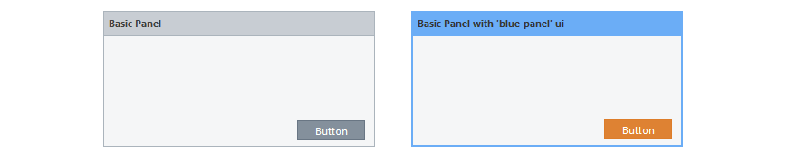
var panel = Ext.widget('panel', {
    title: 'Basic Panel',
    frame: true,
    height: 150,
    width: 300,
    buttons:[{
        text:'Button'
    }]
});
var panel = Ext.widget('panel', {
title: "Basic Panel with 'blue-panel' ui",
frame: true,
height: 150,
width: 300,
ui: 'blue-panel',
buttons:[{
text:'Button',
ui:'orange-button'
}]
});This panel got a blue frame from ui: 'blue-panel' config, and the button
became orange by applying ui: 'orange-button' config.
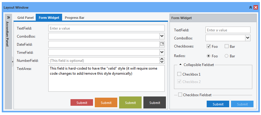
The following table shows which Ext components can be styled this way.
| Colors | Widget | State |
|---|---|---|
|
Blue Green Red Orange Black |
Window Panel Tab Panel Button Progress Bar |
default active |
The list of all applicable ui values is shown in the following table.
| State/Widget | Window | Panel | Tab Panel | Progress Bar | Button |
|---|---|---|---|---|---|
| default | blue-window | blue-panel | blue-tab | blue-progress | blue-button |
| green-window | green-panel | green-tab | green-progress | green-button | |
| red-window | red-panel | red-tab | red-progress | red-button | |
| orange-window | orange-panel | orange-tab | orange-progress | orange-button | |
| black-window | black-panel | black-tab | black-progress | black-button | |
| active | blue-window-active | blue-panel-active | blue-tab-active | blue-progress-active | blue-button-active |
| green-window-active | green-panel-active | green-tab-active | green-progress-active | green-button-active | |
| red-window-active | red-panel-active | red-tab-active | red-progress-active | red-button-active | |
| orange-window-active | orange-panel-active | orange-tab-active | orange-progress-active | orange-button-active | |
| black-window-active | black-panel-active | black-tab-active | black-progress-active | black-button-active |
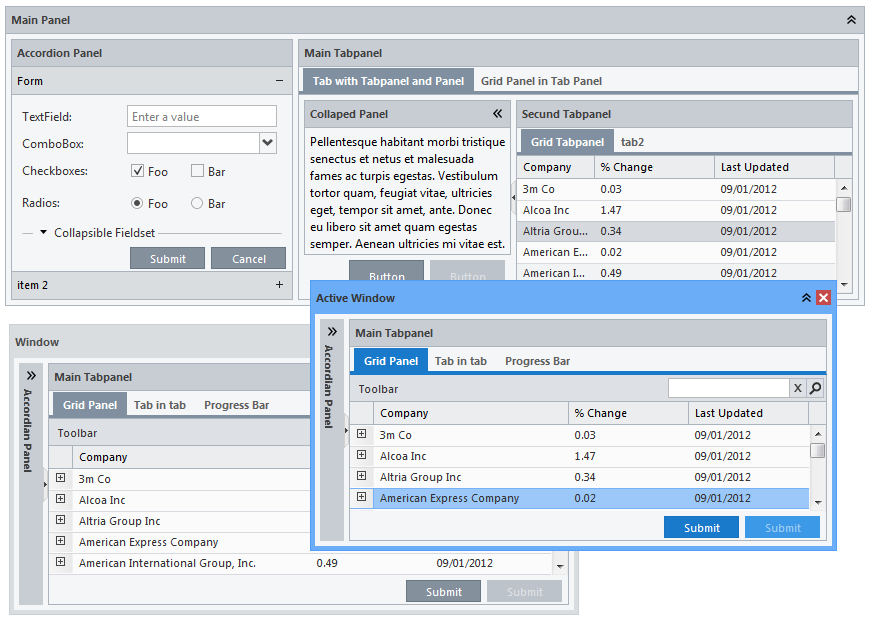
Active Window
Effects of any *-active ui style will be visible only while widget's parent window is active. The widget will turn to gray appearance when the parent window is deactivated (loses focus).# Windows
Window ui styles allow quick and simple change of
the application appearance. By applying a particular ui style
to a window you are changing its appearance, but also all elements contained within that window will inherit
its base color.
| UI | Applicable to (xtype) | Components that inherit base color |
|---|---|---|
|
blue-window blue-window-active red-window red-window-active orange-window orange-window-active green-window green-window-active black-window black-window-active |
window |
tabpanel gridpanel button |
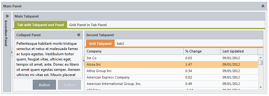
 Panels are highlighted when the containing window is active.
 ui with the suffix -active should be used.
# Panels
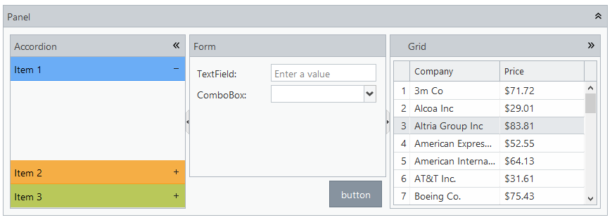
By default, panels don't inherit any base color from the parent window and appear gray, however, any grid within the panel will inherit its base color.
| UI | Applicable to (xtype) | Components that inherit base color |
|---|---|---|
|
blue-panel blue-panel-active red-panel red-panel-active orange-panel orange-panel-active green-panel green-panel-active black-panel black-panel-active |
panel gridpanel form |
grid |
Panel ui style can be set for different panel types.
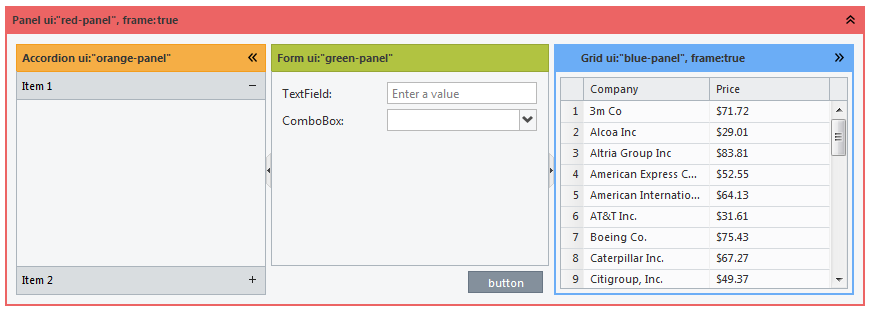
Panel ui style can be set for accordion items too.
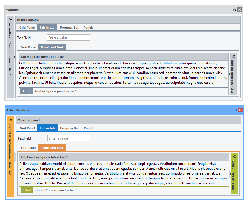
# Tab Panels
| UI | Applicable to (xtype) | Components that inherit base color |
|---|---|---|
|
blue-tab blue-tab-active red-tab red-tab-active orange-tab orange-tab-active green-tab green-tab-active black-tab black-tab-active |
tabpanel | grid |
A grid contained within tab panel inherits base color from
ui style applied to that tab panel.
# Buttons
| UI | Applicable to (xtype) | Components that inherit base color |
|---|---|---|
|
blue-button blue-button-active red-button red-button-active orange-button orange-button-active green-button green-button-active black-button black-button-active |
button | none |
ui styles can also be applied to buttons.
# Progress Bars
| UI | Applicable to (xtype) | Components that inherit base color |
|---|---|---|
|
blue-progress red-progress orange-progress green-progress black-progress |
progress bar | none |
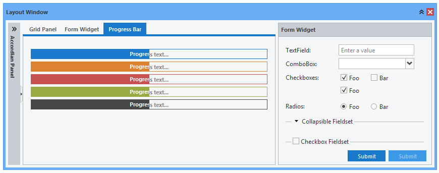
ui styles can also be applied to progress bars.