Getting Started With Azzurra 6
# Installation
To install Azzurra 6 theme in your application please follow these steps:
1. Extract Azzurra 6 zip package in your packages/local folder
Azzurra zip file contains four Ext packages. Extract all of them.
2. Switch to Azzurra 6 theme
Open your app.json file and select Azzurra in theme property:
"theme": "codaxy-azzurra-classic",
"theme": "codaxy-azzurra-modern",At this point, your application should take Azzurra default gray appearance.
3. Include ui Styles
To include ui styles in CSS open codaxy-azzurra-classic/sass/src/Component.scss and add the following snippet.
@include codaxy-all-ui();The default appearance is boring, so try using ui styles to make your app more visually appealing.
Possible Production Build Issue
In the latest Sencha CMD versions, production build may show errors similar tounknown definition for mixin named _codaxy-table-ui : ../extjs/packages/codaxy-core-classic/sass/etc/ui/panel.scss:69
This can be solved by adding the following code snippet to application main .js file:
requires: [
    'Ext.tab.Panel',
    'Ext.tab.Tab',
    'Ext.tab.Bar' ,
    'Ext.layout.container.Accordion',
    'Ext.window.Window',
    'Ext.view.Table',
    'Ext.panel.Panel'
]
# UI Styles
Azzurra 6 classic toolkit theme heavily relies on the ui component config (see Sencha Docs)
for enhancing the appearance of Ext JS widgets. To understand how ui config
is applied, check the following example.
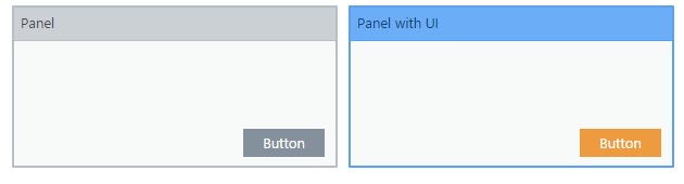
var panel = Ext.widget('panel', {
title: 'Panel',
frame: true,
height: 150,
width: 300,
buttons: [{
text: 'Button'
}]
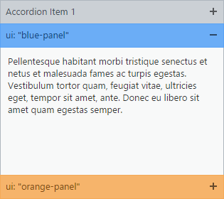
});var panel = Ext.widget('panel', {
title: 'Panel with UI',
ui: 'blue-panel',
frame: true,
height: 150,
width: 300,
buttons: [{
text: 'Button',
ui: 'orange-button'
}]
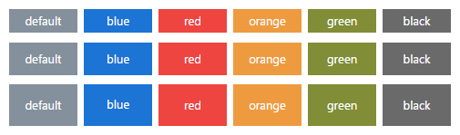
});The following table shows which Ext components support ui styles.
| Widget | Colors | State |
|---|---|---|
|
Window Panel ( panel, gridpanel, form)Tab Panel Button Progress Bar |
Blue Green Red Orange Black |
default active |
The list of all applicable ui values is shown in the following table.
Before using style, let's learn how to include styles in your application's CSS.
| State/Widget | Window | Panel | Tab Panel | Progress Bar | Button |
|---|---|---|---|---|---|
| default | blue-window | blue-panel | blue-tab | blue-progress | blue-button |
| green-window | green-panel | green-tab | green-progress | green-button | |
| red-window | red-panel | red-tab | red-progress | red-button | |
| orange-window | orange-panel | orange-tab | orange-progress | orange-button | |
| black-window | black-panel | black-tab | black-progress | black-button | |
| active | blue-window-active | blue-panel-active | blue-tab-active | blue-progress-active | blue-button-active |
| green-window-active | green-panel-active | green-tab-active | green-progress-active | green-button-active | |
| red-window-active | red-panel-active | red-tab-active | red-progress-active | red-button-active | |
| orange-window-active | orange-panel-active | orange-tab-active | orange-progress-active | orange-button-active | |
| black-window-active | black-panel-active | black-tab-active | black-progress-active | black-button-active |
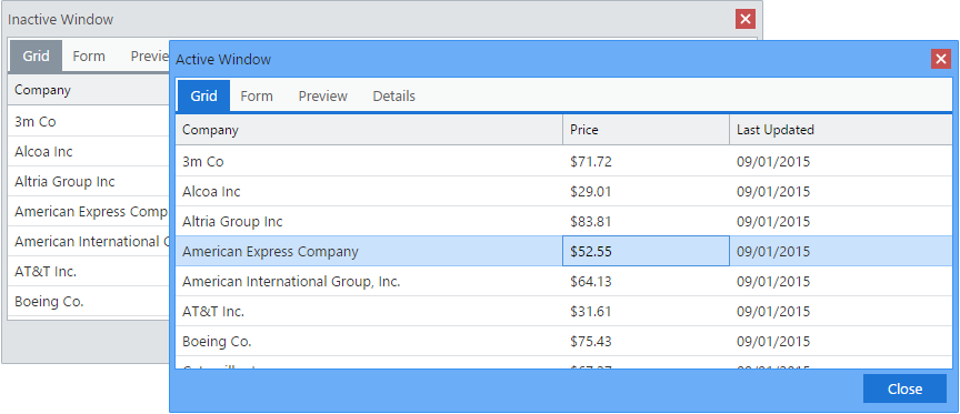
Active Window
Effects of any*-activeui style will be visible only while widget's parent window is active. The widget will turn to gray appearance when the parent window is deactivated (loses focus).
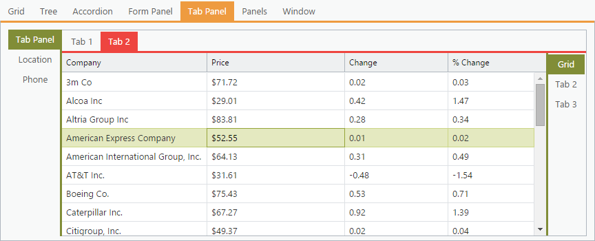
# Windows
Window ui styles are used for coloring windows within an application.
List of available window ui styles is shown below:
blue-window-activered-windowred-window-activeorange-windoworange-window-activegreen-windowgreen-window-activeblack-windowblack-window-active
Azzurra 6 classic toolkit includes JavaScript code which sets 'blue-window-active'ui as a default for all windows, which means that by default any window will turn blue once it's activated.
To override the default behavior, you should apply ui style in your window config.
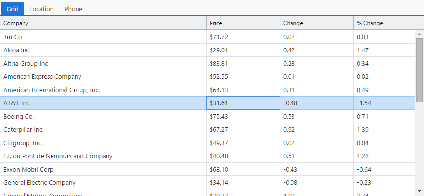
Tab panels, grids, and buttons inherit ui style from the parent window. For that reason in the screenshot above, tab panel, grid and button are also displayed in blue while the parent window is active.
# Panels
Panel ui styles are used to change the color of the panel's title or border (if the panel is framed), as shown in the following example.
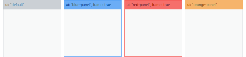
items: [{
    title: 'ui: "default"',
    height: 200,
    width: 203
}, {
    title: 'ui: "blue-panel", frame: true',
    ui: 'blue-panel',
    frame: true,
    height: 200,
    width: 203
}, {
    title: 'ui: "red-panel", frame: true',
    ui: 'red-panel',
    frame: true,
    height: 200,
    width: 203
}, {
    title: 'ui: "orange-panel"',
    ui: 'orange-panel',
    height: 200,
    width: 203
}]
List of available panel ui styles:
blue-panelred-panelgreen-panelorange-panelblack-panelblue-panel-activered-panel-activegreen-panel-activeorange-panel-activeblack-panel-active
Panel ui styles may also be applied to grid and form panels (grid, form).
Panels do not inherit ui color from the parent window and appear gray. However, any grid within the panel will inherit its ui color.
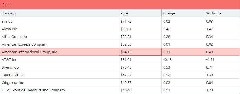
Panel ui style can be set to accordion items too.
# Tab Panels
Tab panel ui styles are used to enhance the visual appearance of tab panels.
List of available tab ui styles:
blue-tabred-tabgreen-taborange-tabblack-tabblue-tab-activered-tab-activegreen-tab-activeorange-tab-activeblack-tab-active
ui style applied to that tab panel.
# Buttons
Buttons can be styled using ui styles:
blue-buttonred-buttonorange-buttongreen-buttonblack-buttonblue-button-activered-button-activegreen-button-activeorange-button-activeblack-button-active
Any button located inside a window will inherit parent window's ui color.
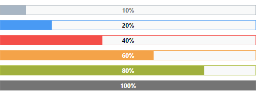
# Progress Bars
Progress bar components can be styled using ui styles:
blue-progressred-progressorange-progressgreen-progressblack-progressblue-progress-activered-progress-activeorange-progress-activegreen-progress-activeblack-progress-active